Team Rembrandts Outlined
What I was working on
Every year, the Media & Branding sub-department designs a notebook for the competition abroad. This notebook highlights the work during the season from every sub-department within the team. The notebook starts with an introduction to the team and the team structure.
Different aspects of the team
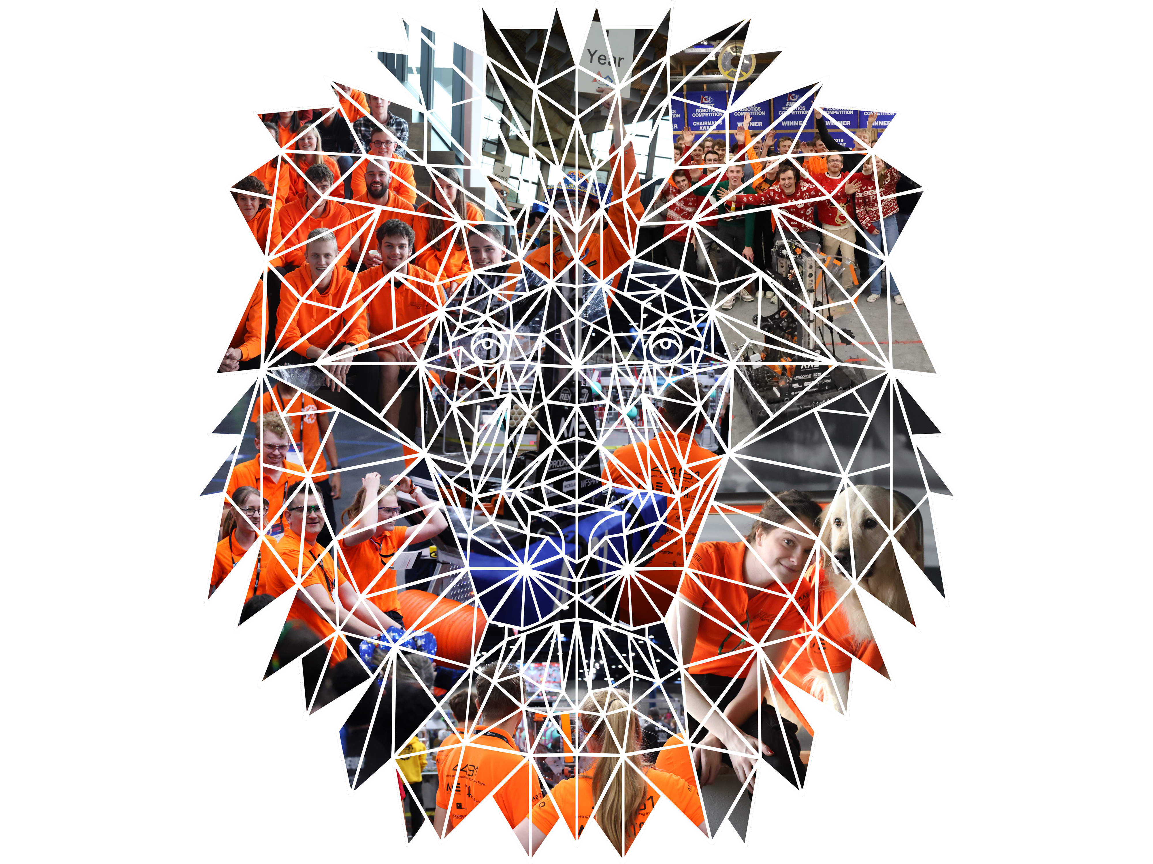
I wanted to create an illustration that truly shows the different aspects of the team. It starts with the history on top and proceeds towards different events: the different faces of competition, casual team evenings and company relations.
What I did
The notebook is the biggest graphic design project of the entire season. Although some parts can be used every year, we aim to create a new design every year.
The lion lines
The original design with the lion lines is an older design that was already available within the team's branding. The trade shirts, used for trading with other teams during competition featured the orange version of the lion lines.
From orange to white
In Adobe Illustrator, I made an outline of the orange version to create a white version. I divided the white outline in different larger segments for the photos to be filled in. In that way, both the images as the outline is visible.
From white to colour
After finding suitable images, I filled the segments with the images using a fill mask. After making small adjustments, the final result was an illustration with the different images and the lion outline.
What I delivered
The illustration is for multiple years the background between the two pages about team identity and team structure.